The challenge was to create an intuitive, scalable, and customizable app with functionalities tailored to the congregation's needs.
The church had a website, but it was underutilized due to the demographic's preference for mobile apps and the lack of necessary features on the site.
The project consisted of two phases: an MVP (Minimum Viable Product) launch and a full feature rollout.
When discussions about a potential mobile app started circulating, I saw an opportunity to make a real difference. Volunteering to lead the project, I stepped into the role of solo product designer.
Understanding Our Flock: Deep Dive into User Research
To create an app that truly served our community, we needed to understand their needs. But here’s the catch, I was now over 1000 miles away from the community. I still needed a way to get a make research that provided relevant insight. So here’s what I did:
Data Analysis: We dove into our website analytics to identify patterns and pain points
Competitive Analysis: We reviewed other church apps to understand best practices and common pitfalls
The Big Idea... An app for everyone (?)
To make sure we got it right, we did our homework: We watched how people used other church apps (the good and the bad), we looked at how people were using our old website, we checked out what other churches were doing with their apps.
What we learned
Planning.
The project was divided into two phases. Phase one, which included the MVP release and then the full feature rollout. The scope was influenced by the need for regular iterations and the back-and-forth required to align with the church administration and engineering efforts.
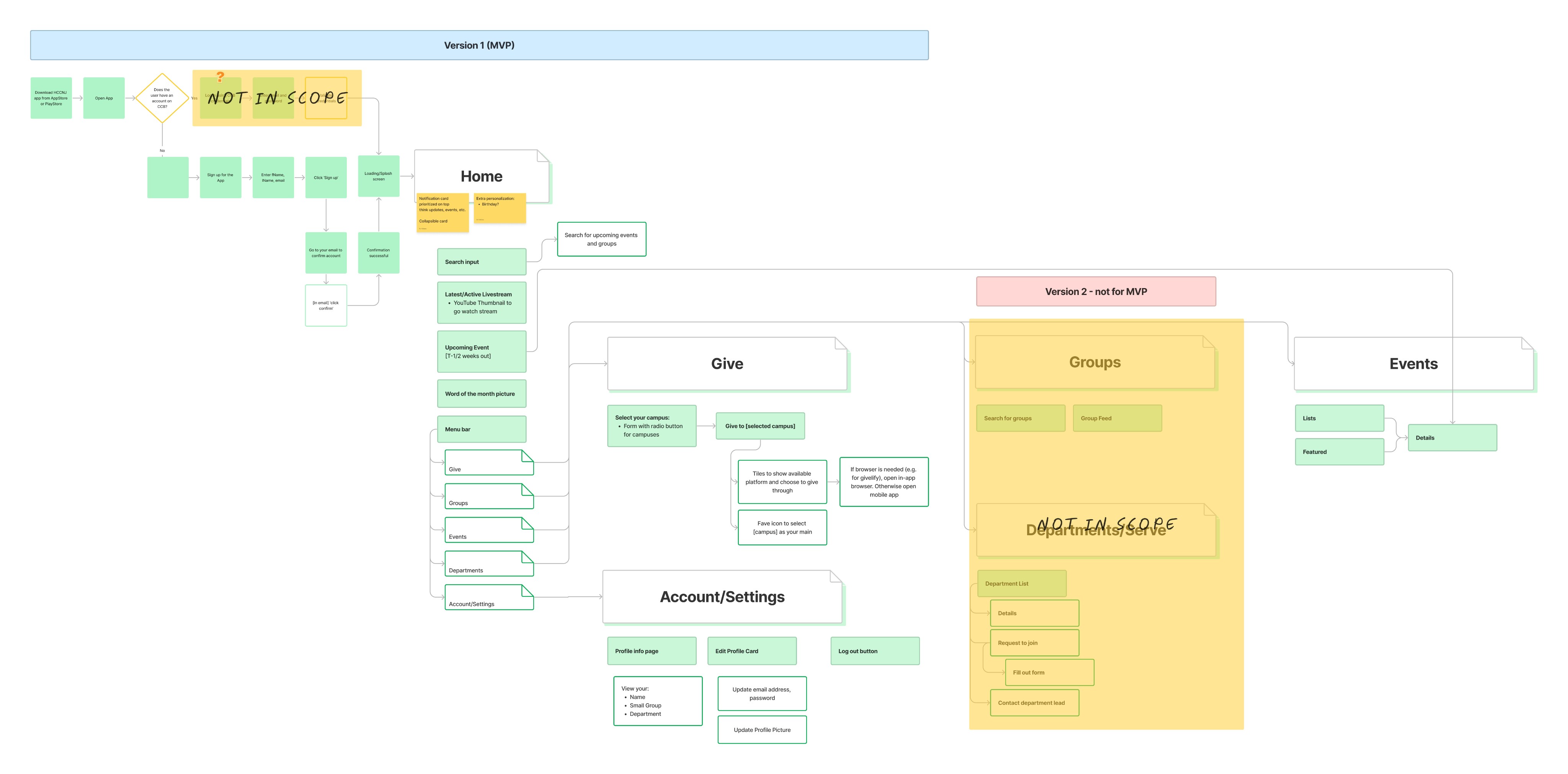
Mapping out the user journey
Guiding principles
Keep It Simple: If grandma can't use it, it's too complicated
Everything at Your Fingertips: Find what you need in just a tap or two
Room to Grow: Make sure the app can keep up as our church grows
Let the explorations begin!
I went through several iterations, leading working sessions with my co-designer and sharing progress with the product, engineering, and documentation teams to keep everyone aligned.
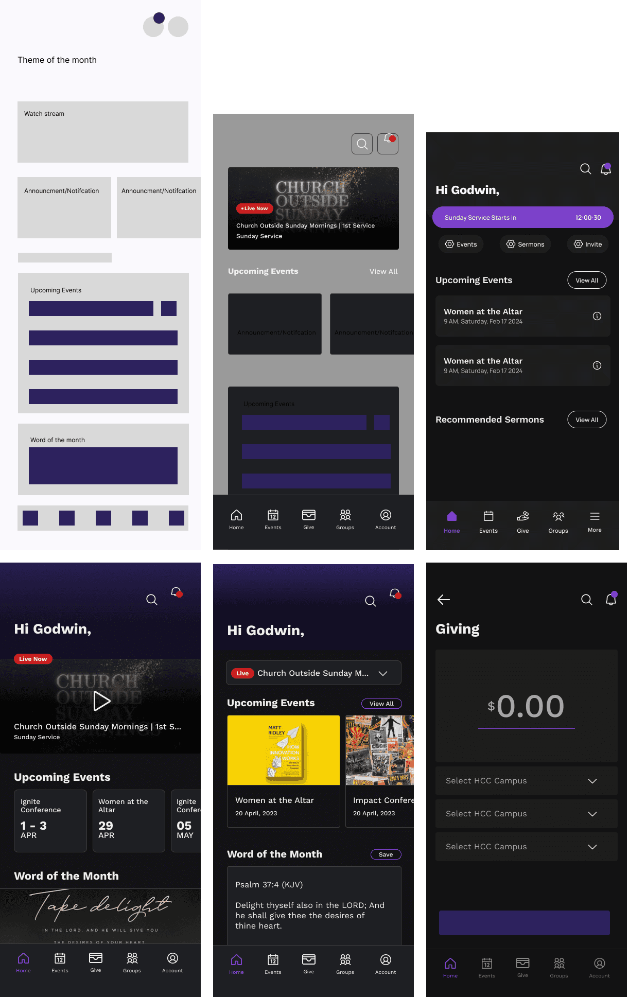
Iterations... iterations...
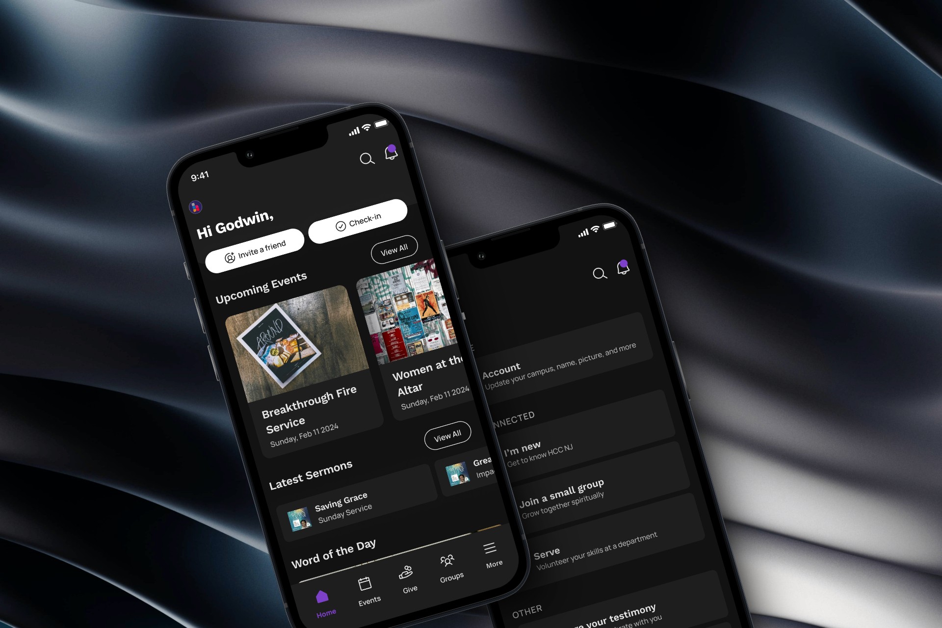
The Big Reveal
The launch of our app was met with enthusiasm from the congregation.
The app's layout was designed to prioritize user needs. The homepage featured quick actions like check-ins, sermon access, and event invites. The user interface followed a simple and scalable structure, allowing the church to add new campuses seamlessly.
Key features like account management were placed prominently for easy access. The goal was to create a smooth user flow with minimal friction, reducing the need for unnecessary clicks.
Testimonial

